Post by Princess Ariel on Apr 30, 2014 14:01:53 GMT -5
Photo Shoot 2 - Careers
CRITIQUES
Emilie De Rochefort

Jensen: This is super cute Emelie! The pose is nice although you do lose some of your neck but to be able to look this good while holding an action pose, that's good. I'm not sure I 100% buy this as a volleyball player because of the ball, but I definitely see where you were going with this and I do like it on a visual level.
Ariel: This is cute in a way, but super unappealing in another. Your body looks all sorts of contorted in this shot and your ass-back is just too distracting. The swimsuit has white lines everywhere making it look like it was poorly photoshopped in. That being said, I see a volleyball player so theme execution was on point. However, I don't feel as though this look is polished enough to deserve much praise. Sorry, Jensen.
Doctor: It's moments like this that make me realize I'm the Simon Cowell of the judges. Every good series needs one though. Unlike the other judges...I find this horrible. You've lost your neck, your bikini is sinking into your skin and your ass crack is creeping up your back. Awkward posing can be brilliant, but you must always make sure it doesn't make smaller details appear unflattering. As for the theme...I don't buy it. You're on the beach, but there's NOTHING in this to suggest you're playing volleyball. Even if we're to assume the beach ball is being used for that specific sport...that's nothing to suggest it's a career worthy game rather than just a summer afternoon game between friends. You will not do well with me in scoring.
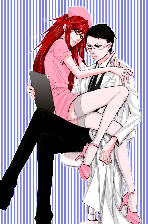
Grell Sutcliff

Jensen: I like this. I like the connection with the doctor and the camera. I do not like the background though. Too distracting. Pink is my favourite colour as well, so I like your uniform for sure lol Your legs are awewsome. Very nice job!
Ariel: I would kill for those legs, you little slut. Great connection with the camera and interaction with the doctor in your picture! Theme execution was on point and I'm very impressed with what you've put forward this round. I also hate the background though. It's really tacky and takes away from what you delivered in the shot. Really good submission though!
Doctor: Um. The other judges said everything that needs said. I'd just be repeating them. So I'll take this time to ask if you'd like to take a trip to see the Medusa Cascade.
Hatsune Miku

Jensen: I love this. You can totally see the movement in this photo and everything flying about screams dancing to me. You really look great while doing it as well. The bangs are a bit much because they're hiding a good portion of your face but overall, this photo is fantastic. And I honestly have no clue who you are so it's not predictable for me.
Ariel: This is a very beautiful submission, Miku. And I really thank you for stepping away from predictability with your submission this week. I'm absolutely loving your body in this shot. You look so elegant and the execution of a dancer is just there. Amazing submission and so proud!
Doctor: We lose a lot of your face and your torso looks way too long. Other than that, I think you did amazing. Keep up the great work.
Hinata Hyūga
Did Not Submit

Poison Ivy

Jensen: I like this. I love the connection with your scenery. The way you're looking at the rose and holding it. I really like the connection overall and you look good as well.
Ariel: OMG this is so cute for Ivy! I was really looking forward to seeing what you were going to submit and I think this is excellent. Would've loved a little more connection with the camera, but I'm so glad you gave us something besides the basic pin-up girl attire! I'm a fan!
Doctor: I was sooo hoping you'd choose this over your doctor one. You have a lot more chemistry with your career in this shot than in the other, which really helps to sell any photo. The modelling is very subtle, but I think it'd work terrifically in commercial work. I think you did well. Good job.
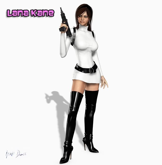
Lana Kane

Jensen: I really like this. This would have been perfect for model potential but then it would have been used up lol I love the legs, they are to die for!! I love the outfit and how super cute it looks on you and I really like your face here. Great come back!
Ariel: Shockingly, I appreciate this shot from you. Like Jensen stated, this would've been perfect for last round. As for a career shoot... you're right it's really safe. Thank you for submitting something worth talking about though!
Doctor: Vast improvement from last round. I love that you're still trying your best despite clearly being on borrowed time. Never give up! As for the shot, it's generic, but it fits the theme nicely. That in itself will put you better off than a few on my scores. Good job. Keep up the fight.
Maleficent

Jensen: Wow. This is really creative. Totally unexpected because I've never even heard of Osteologist lol I totally agree with what you've said here as well. I like this. I love the connection with the bones and a good profile shot always works for me. Great job!
Ariel: I find myself once again being impressed and let down at the same time. Creative take on a career path, but not much modeling going on to make this a winning shot in my eyes. I want to see connection with the camera and modeling potential with every submission. This definitely belongs in a biology textbook. On the top shelf collecting dust. It's a good submission, but I'm looking for a model.
Doctor: I'm the reverse of Ariel. I love the facial modeling you've done and think this is GORGEOUS, but I'm not sure I completely buy the career. In the world of fantasy, I can see it. The bones being magically alive and you sexually obsessed. Not so sure the bird bones feels the same way about you though, Maleficent. xD Submitting this form of artwork was a risky move, due to potential quality issues...but I think it paid off. It looks good and the artist has skill.
Raven Queen

Jensen: I actually would never think to do Interior Designer, so I like that. I love the pose and love those shoes. The outfit is cute as well. I think you've made a good connection with your job of choice and that's good. Good job.
Ariel: While I appreciate your choice of career path, there's nothing that makes this shot stand out for me. Some may call me a little critical, but this is very middle-of-the-road in my eyes. I feel like you went down the model-basics checklist. Post, outfit, connection... but forgot to give us something impressive to remember this shot by. A good submission, but I want greatness from you because I know you have it in you!
Doctor: Ariel nailed everything I was thinking in regards to your modelling. She gave good advice, so I hope you listen to it. As for your career...I never would have guessed by simply looking at this photo what your career was. Even knowing what it is...I see no connection between you and your career. If you were holding some paint, interacting with a piece of furniture or simply staring at your work...then I'd see the connection and love it more. Here though, you're not acknowledging the room in the slightest. Jensen's crazy. xD
Rikku

Jensen: Because of your outfit and lack of background, it feels so much like your first shoot. I can look past that though. I like how real your legs look. I think you've done a great job at choosing a career as well, it's obvious without being told and that's good. Very nice job.
Ariel: I'm not really loving this submission, Rikku. The face is all a little distorted and taking away from Rikku's beauty. I definitely see a musician without being told so theme execution was well done. YOu also have a massive wedgie/cameltoe which is all very distracting. A good shot but I want to see you shooting for the stars, not settling in the middle. A safe submission.
Doctor: Wayyy too much orange going on. It's overwhelming your skin complexion. The pose is generic, but the career is obvious and goes well with your personality. For future rounds, you need to mix up the style you give us. Like Jensen said, this feels very similar to your first shoot. As if you literally just picked up the guitar 2 seconds after the first photo was taken. lol Mix it up and show us more.
Samus Aran

Jensen: I don't need to see the bike to get it. Your outfit and helmet and knee pads make it obvious to ME what your career is. I can barely see the cigar so the smoke coming out of your mouth seemed really weird. I like your face and hair and you look super confident. Good job!
Ariel: I love this because of the old-timey advertisement vibe it's giving off. Definitely seeing a badass biker chick hanging out at a space bar. Very impressive submission in terms of theme execution because you didn't even need a bike to show your career. Amazing work once again!
Doctor: Everything about this is perfection, in my opinion. Brava.
CRITIQUES
Emilie De Rochefort

Jensen: This is super cute Emelie! The pose is nice although you do lose some of your neck but to be able to look this good while holding an action pose, that's good. I'm not sure I 100% buy this as a volleyball player because of the ball, but I definitely see where you were going with this and I do like it on a visual level.
Ariel: This is cute in a way, but super unappealing in another. Your body looks all sorts of contorted in this shot and your ass-back is just too distracting. The swimsuit has white lines everywhere making it look like it was poorly photoshopped in. That being said, I see a volleyball player so theme execution was on point. However, I don't feel as though this look is polished enough to deserve much praise. Sorry, Jensen.
Doctor: It's moments like this that make me realize I'm the Simon Cowell of the judges. Every good series needs one though.
 Unlike the other judges...I find this horrible. You've lost your neck, your bikini is sinking into your skin and your ass crack is creeping up your back. Awkward posing can be brilliant, but you must always make sure it doesn't make smaller details appear unflattering. As for the theme...I don't buy it. You're on the beach, but there's NOTHING in this to suggest you're playing volleyball. Even if we're to assume the beach ball is being used for that specific sport...that's nothing to suggest it's a career worthy game rather than just a summer afternoon game between friends. You will not do well with me in scoring.
Grell Sutcliff

Jensen: I like this. I like the connection with the doctor and the camera. I do not like the background though. Too distracting. Pink is my favourite colour as well, so I like your uniform for sure lol Your legs are awewsome. Very nice job!
Ariel: I would kill for those legs, you little slut. Great connection with the camera and interaction with the doctor in your picture! Theme execution was on point and I'm very impressed with what you've put forward this round. I also hate the background though. It's really tacky and takes away from what you delivered in the shot. Really good submission though!
Doctor: Um. The other judges said everything that needs said. I'd just be repeating them. So I'll take this time to ask if you'd like to take a trip to see the Medusa Cascade.

Hatsune Miku

Jensen: I love this. You can totally see the movement in this photo and everything flying about screams dancing to me. You really look great while doing it as well. The bangs are a bit much because they're hiding a good portion of your face but overall, this photo is fantastic. And I honestly have no clue who you are so it's not predictable for me.
Ariel: This is a very beautiful submission, Miku. And I really thank you for stepping away from predictability with your submission this week. I'm absolutely loving your body in this shot. You look so elegant and the execution of a dancer is just there. Amazing submission and so proud!
Doctor: We lose a lot of your face and your torso looks way too long. Other than that, I think you did amazing. Keep up the great work.
Hinata Hyūga
Did Not Submit

Poison Ivy

Jensen: I like this. I love the connection with your scenery. The way you're looking at the rose and holding it. I really like the connection overall and you look good as well.
Ariel: OMG this is so cute for Ivy! I was really looking forward to seeing what you were going to submit and I think this is excellent. Would've loved a little more connection with the camera, but I'm so glad you gave us something besides the basic pin-up girl attire! I'm a fan!
Doctor: I was sooo hoping you'd choose this over your doctor one. You have a lot more chemistry with your career in this shot than in the other, which really helps to sell any photo. The modelling is very subtle, but I think it'd work terrifically in commercial work. I think you did well. Good job.

Lana Kane

Jensen: I really like this. This would have been perfect for model potential but then it would have been used up lol I love the legs, they are to die for!! I love the outfit and how super cute it looks on you and I really like your face here. Great come back!
Ariel: Shockingly, I appreciate this shot from you. Like Jensen stated, this would've been perfect for last round. As for a career shoot... you're right it's really safe. Thank you for submitting something worth talking about though!
Doctor: Vast improvement from last round. I love that you're still trying your best despite clearly being on borrowed time. Never give up! As for the shot, it's generic, but it fits the theme nicely. That in itself will put you better off than a few on my scores. Good job. Keep up the fight.

Maleficent

Jensen: Wow. This is really creative. Totally unexpected because I've never even heard of Osteologist lol I totally agree with what you've said here as well. I like this. I love the connection with the bones and a good profile shot always works for me. Great job!
Ariel: I find myself once again being impressed and let down at the same time. Creative take on a career path, but not much modeling going on to make this a winning shot in my eyes. I want to see connection with the camera and modeling potential with every submission. This definitely belongs in a biology textbook. On the top shelf collecting dust. It's a good submission, but I'm looking for a model.
Doctor: I'm the reverse of Ariel. I love the facial modeling you've done and think this is GORGEOUS, but I'm not sure I completely buy the career. In the world of fantasy, I can see it. The bones being magically alive and you sexually obsessed. Not so sure the bird bones feels the same way about you though, Maleficent. xD Submitting this form of artwork was a risky move, due to potential quality issues...but I think it paid off. It looks good and the artist has skill.
Raven Queen

Jensen: I actually would never think to do Interior Designer, so I like that. I love the pose and love those shoes. The outfit is cute as well. I think you've made a good connection with your job of choice and that's good. Good job.
Ariel: While I appreciate your choice of career path, there's nothing that makes this shot stand out for me. Some may call me a little critical, but this is very middle-of-the-road in my eyes. I feel like you went down the model-basics checklist. Post, outfit, connection... but forgot to give us something impressive to remember this shot by. A good submission, but I want greatness from you because I know you have it in you!
Doctor: Ariel nailed everything I was thinking in regards to your modelling. She gave good advice, so I hope you listen to it. As for your career...I never would have guessed by simply looking at this photo what your career was. Even knowing what it is...I see no connection between you and your career. If you were holding some paint, interacting with a piece of furniture or simply staring at your work...then I'd see the connection and love it more. Here though, you're not acknowledging the room in the slightest. Jensen's crazy. xD
Rikku

Jensen: Because of your outfit and lack of background, it feels so much like your first shoot. I can look past that though. I like how real your legs look. I think you've done a great job at choosing a career as well, it's obvious without being told and that's good. Very nice job.
Ariel: I'm not really loving this submission, Rikku. The face is all a little distorted and taking away from Rikku's beauty. I definitely see a musician without being told so theme execution was well done. YOu also have a massive wedgie/cameltoe which is all very distracting. A good shot but I want to see you shooting for the stars, not settling in the middle. A safe submission.
Doctor: Wayyy too much orange going on. It's overwhelming your skin complexion. The pose is generic, but the career is obvious and goes well with your personality. For future rounds, you need to mix up the style you give us. Like Jensen said, this feels very similar to your first shoot. As if you literally just picked up the guitar 2 seconds after the first photo was taken. lol Mix it up and show us more.
Samus Aran

Jensen: I don't need to see the bike to get it. Your outfit and helmet and knee pads make it obvious to ME what your career is. I can barely see the cigar so the smoke coming out of your mouth seemed really weird. I like your face and hair and you look super confident. Good job!
Ariel: I love this because of the old-timey advertisement vibe it's giving off. Definitely seeing a badass biker chick hanging out at a space bar. Very impressive submission in terms of theme execution because you didn't even need a bike to show your career. Amazing work once again!
Doctor: Everything about this is perfection, in my opinion. Brava.


