Post by Jensen Ackles on Mar 31, 2014 7:31:50 GMT -5

Honestly, this picture was just too perfect not to use. The above shot is Ariel advertising a stunning new line of waterproof mascara! The immediate focus is to the eyes and I think the advertisement is very product-oriented. Ariel looks absolutely stunning and I honestly just couldn't talk myself out of this shot.
Jensen: Oh darling, I said no make up

The reason I said no make up is because we're doing a make up ad at the end of the game. I'm really sad that you made this mistake. The picture is gorgeous and all, but obviously, you failed to read the directions. You obviously have nothing to worry about though, I'm sure you're not going anywhere no matter what the outcome.
Doctor: Honestly, this is the worst photo you've submitted to date, IMO. You look like you're putting on make-up for the first time. Your face is that of a deer in headlights, you have raccoon eyes and you ignored one of the rules to the photoshoot. No make-up. This will be at the bottom of the list for going against the rules, but even if make-up was allowed...this would still be low because you look like a clueless 13-year old whore.

I was a little hesitant using this picture at first because it is so simplistic. But realistically, this is the type of image you would see used in a magazine ad. It reminds me a lot of a Coach advertisement. I think she looks beautiful and sophisticated and she's doing a great job at selling her item, so hopefully that’s what you guys were looking for this round.
Jensen: I agree with you. It's very reminiscent of a real ad in a magazine. I love your look and your pose. I also like the different hair do then what we're normally used to. You have been very good in giving variety even if you did hate one of your own photos lol Great job. And great colouring btw

Doctor: I think you did an excellent job. We've seen ads just like this out there for handbags. You look so elegant and natural in this. I love that you're constantly showing us different sides of you. Just fantastic.

Jensen: Just a note, the only thing added to this photo was the bottle itself, and the name. We didn't need to even see the bottle to sell it but then we did, since it's a props shoot. I love your image. I love the diamonds and the air flowing around you. I love the heart. This is very good.
Doctor: I despise when models make a photo work instead of finding something that DOES work. Mostly because I think it's cheating. I'm told it's not against the rules HERE, so all I can say is...if you do it...don't let it LOOK edited. Quite frankly...it's very obvious you edited because it's not that great of a job. Your edit work ruins the overall shot and it loses its illusion. Sorry, but this won't do well with me because you took a fabulous photo and ruined it.
(lengthy discussion where everyone realized where everyone was coming from and then true love prevailed as we all got over it)

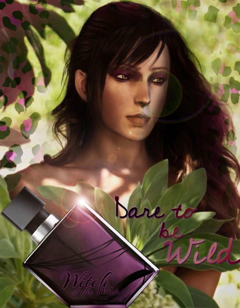
Jensen: I like your face here. I really like the scenery and how you look nude and fresh. I don't like the light effect on your face though, very distracting. This is good.
Doctor: Yeah, I agree with Jensen. The lighting really takes from you. I love this! I really enjoy seeing the softer side of you because it is so contrasting to the you we see. Amazing work!

Rapunzel: My biggest problem last week was focusing too much on the theme. I know it's a polarizing shot so I'm glad that I still get a chance to be here. This week, I'm going to be a model in an advertisement for Red Floral Architecture. In this photo, I'm modelling in front of a 'Floral Arch' to convince the potential customer to pick Red Floral Architecture as their wedding ceremony designer. Red Floral Architecture has gained itself a reputation in the wedding decoration business as a highly stylized and glamorous contemporary flower business specializing in traditional, off the wall, vintage and contemporary floral designs.
Jensen: This is gorgeous. The arch itself seems to take backstage a little too much, but it's there and it's gorgeous. I love your image, I love your hair and I love this photo. Great job.
Doctor: I was completely unfamiliar with your product, so I did some research and familiarized myself before really sitting down to judge you. What I found was that their ads for archways...is done exactly like this. They show a gorgeous yet simple arch and put one or two people posing in a nice, emotion-evoking pose. I think you nailed it perfectly. I think the only downside to this is your hand. It gets lost in your hair. It would've been nice if it were clutching your hair or pulled to your front.

I've decided to advertise some fur this week. He's modelling really well with it. Getting naked once again so it gives more focus to the product.
Jensen: Someone wants that FCO and most likely, he's going to get it, IMO anyway. This is sexy and gorgeous. The lighting the colouring, the body. Your pose is gorgeous, your face in profile is sexy as fuck. And the fur shoal is nicely done.
Doctor: I completely agree with Jensen. I know instantly what it is you're selling and you look amazing while at the same time bringing attention to the item. Very nice work. Oh! Also... *drools*


